Catalyst UXBest Life Pay
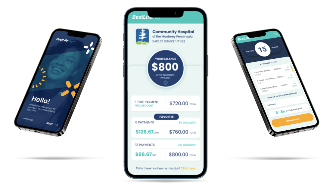
A new all-encompassing experience that eliminates the need for numerous paper invoices, enabling individuals to pay their bills on time, without hassle, and at a cost-effective rate if affordability is of concern.
Discovery | Collaboration | Ideation | Wireframing | Prototyping | Iteration | Usability testing
Role: Lead UX Designer
Team: Catalyst CEO, Design, Client
Tools: Figma, FigJam
Duration: 4 months (2 features)
Medium: Mobile website, desktop browser
Project details
Individuals were overwhelmingly receiving numerous invoices by mail for identical medical bills. The high payment amounts posed a challenge for those unable to manage substantial one-time payments. Consequently, individuals often resorted to late payments or left bills unpaid.
How might we create a mobile website to allow people to make their payments quickly and on time and allow alternative affordable options all while getting rewarded?
Problem
Product goal
Assist users in maintaining their financial health by offering a means to settle their medical bills to prevent debt.
requirements
Objectives
Create a mobile website to provide users with an integrated experience enabling them to:
1) Pay their medical bills quickly from their phone
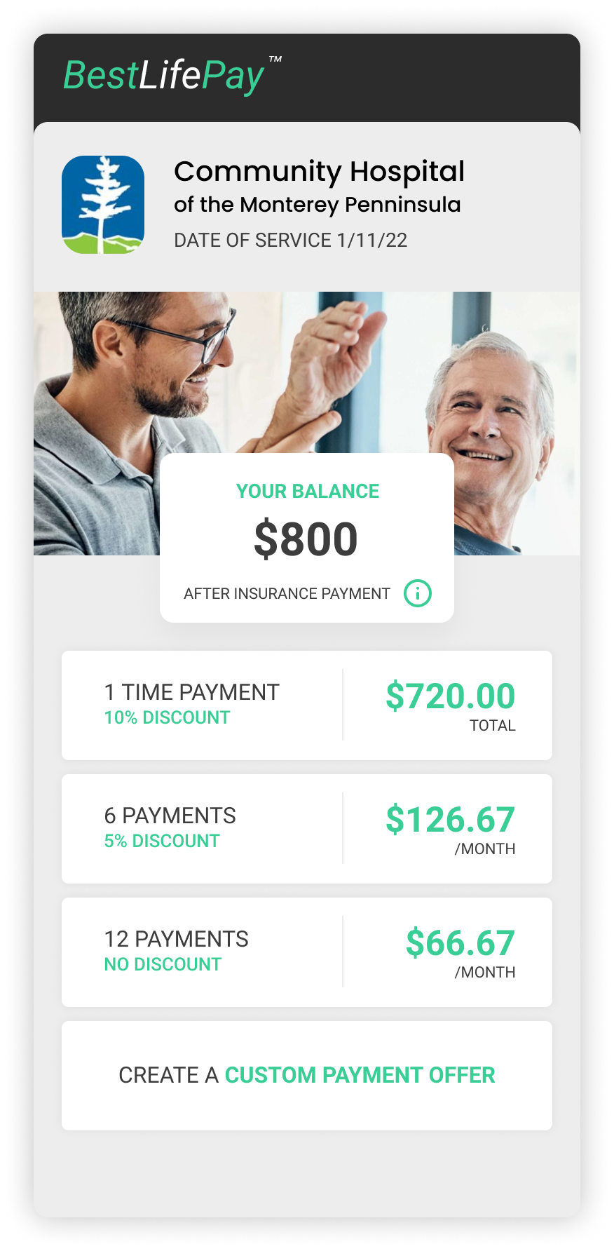
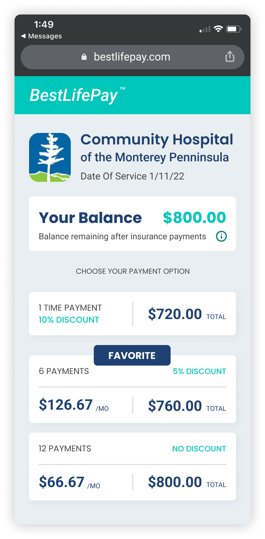
2) Pay their bill in full, choose payment plans offered by the medical facility or create a custom affordable payment plan
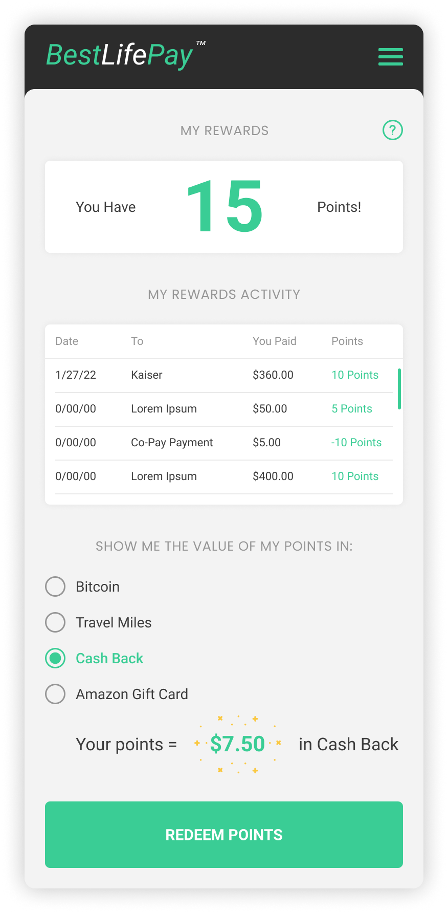
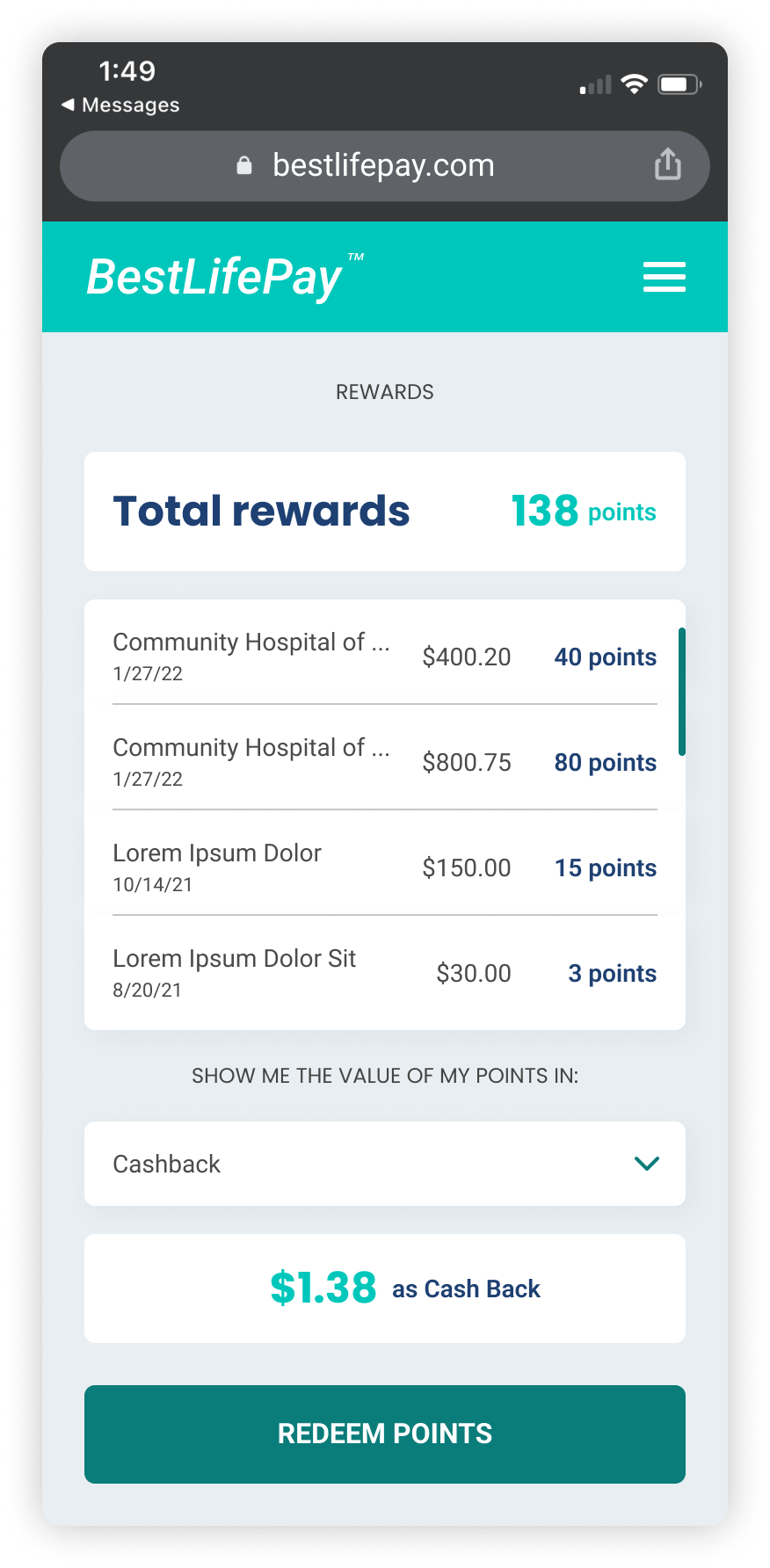
3) Earn points for paying bills on time
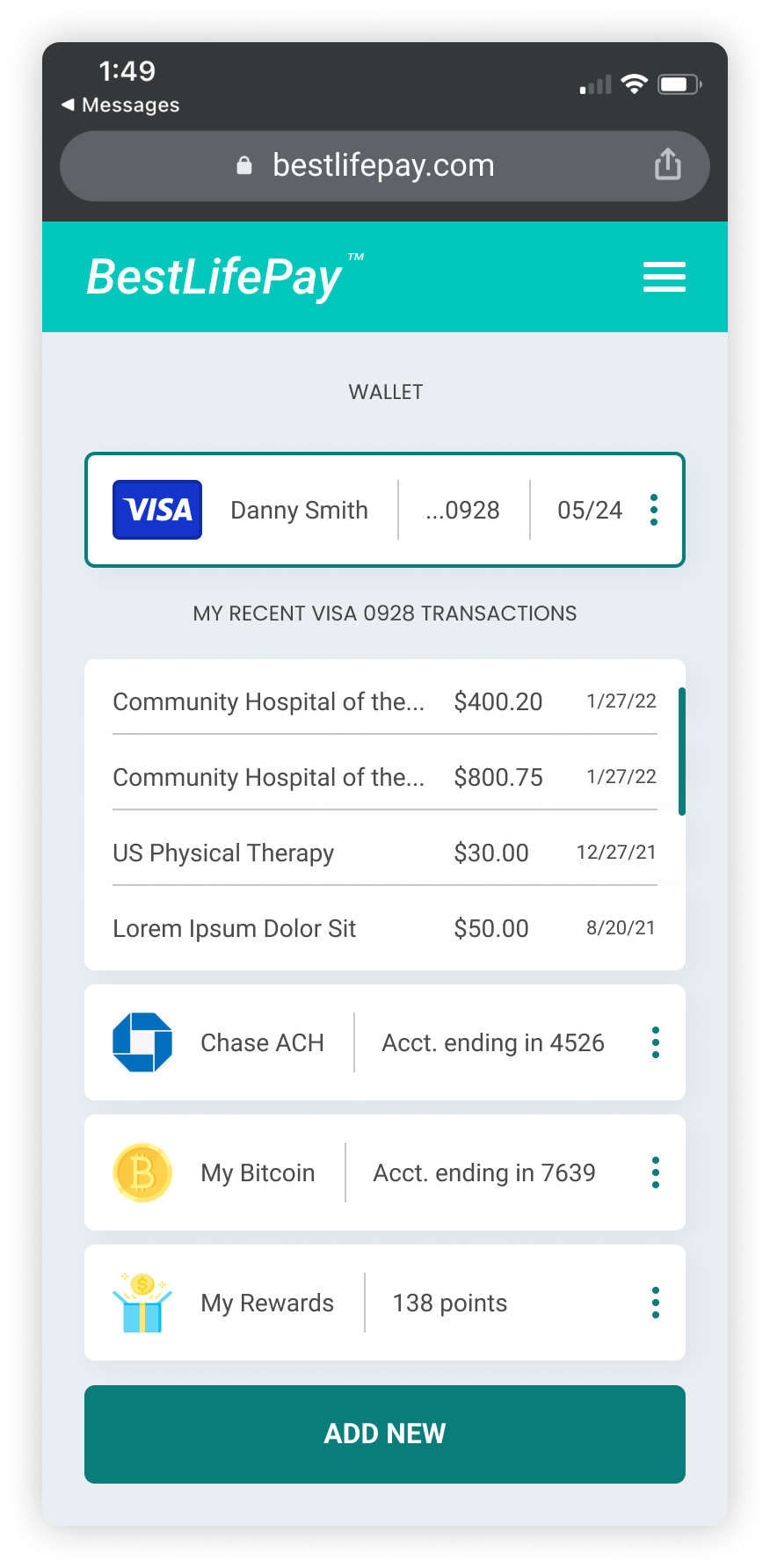
4) Manage their bills and convert their points to their reward of choice
Additionally, create a desktop experience for users to donate money to those in need
Design goals
1) Readability and clear hierarchy
2) Simplicity and ease of use
3) Fun and easy to use
Process
A look into what others were doing
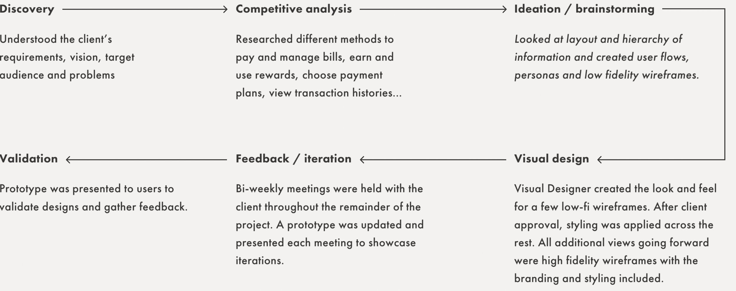
The following artifacts were created and continually referenced to help inform and guide our design process by understanding user needs, behaviors, and the overall user journey.
Design documentation
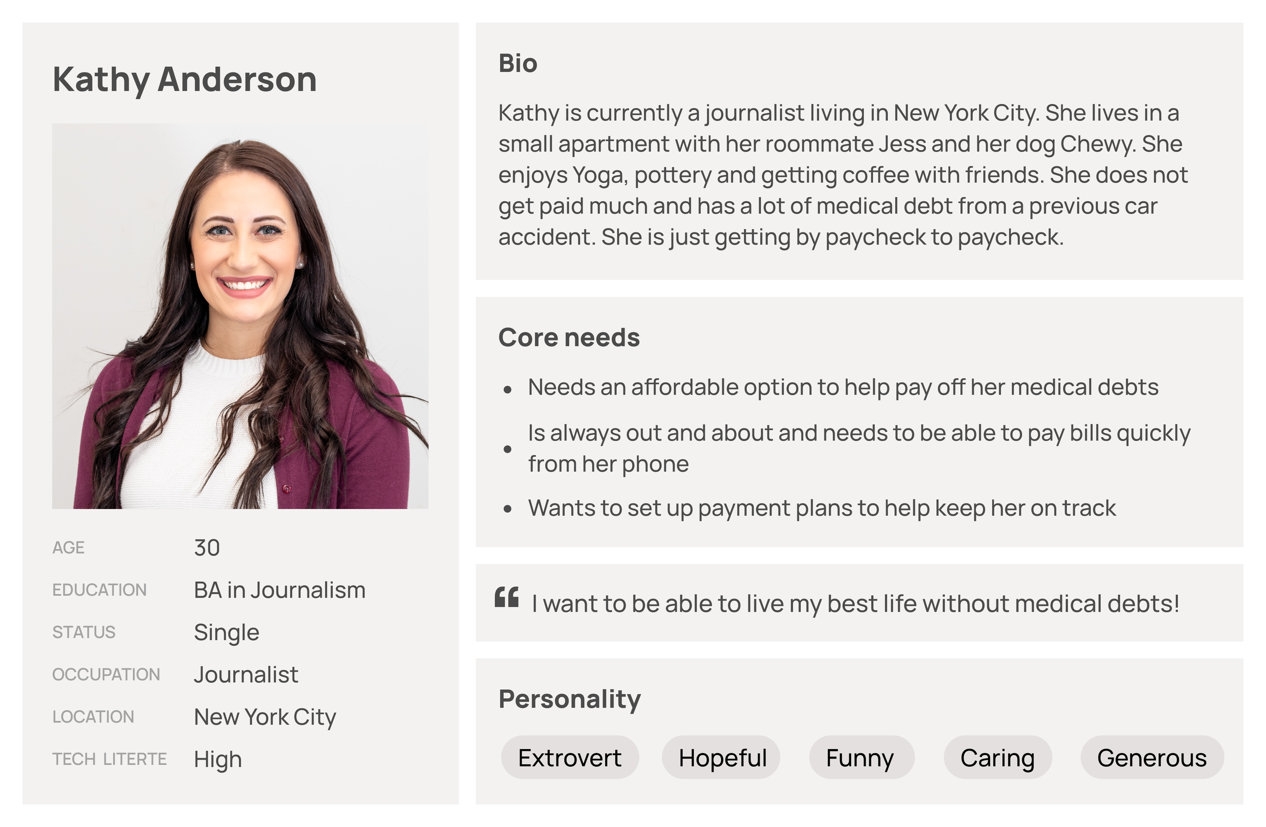
Personas
Kathy is out with her friends, trying out a new dinner spot that just opened up. She receives an email about a medical bill that is still unpaid that is due that same evening. Since she is not near her laptop, she needs to be able to make payment via her phone. Additionally, she does not get much from her paychecks so she is hoping to be able to pay her bill monthly.
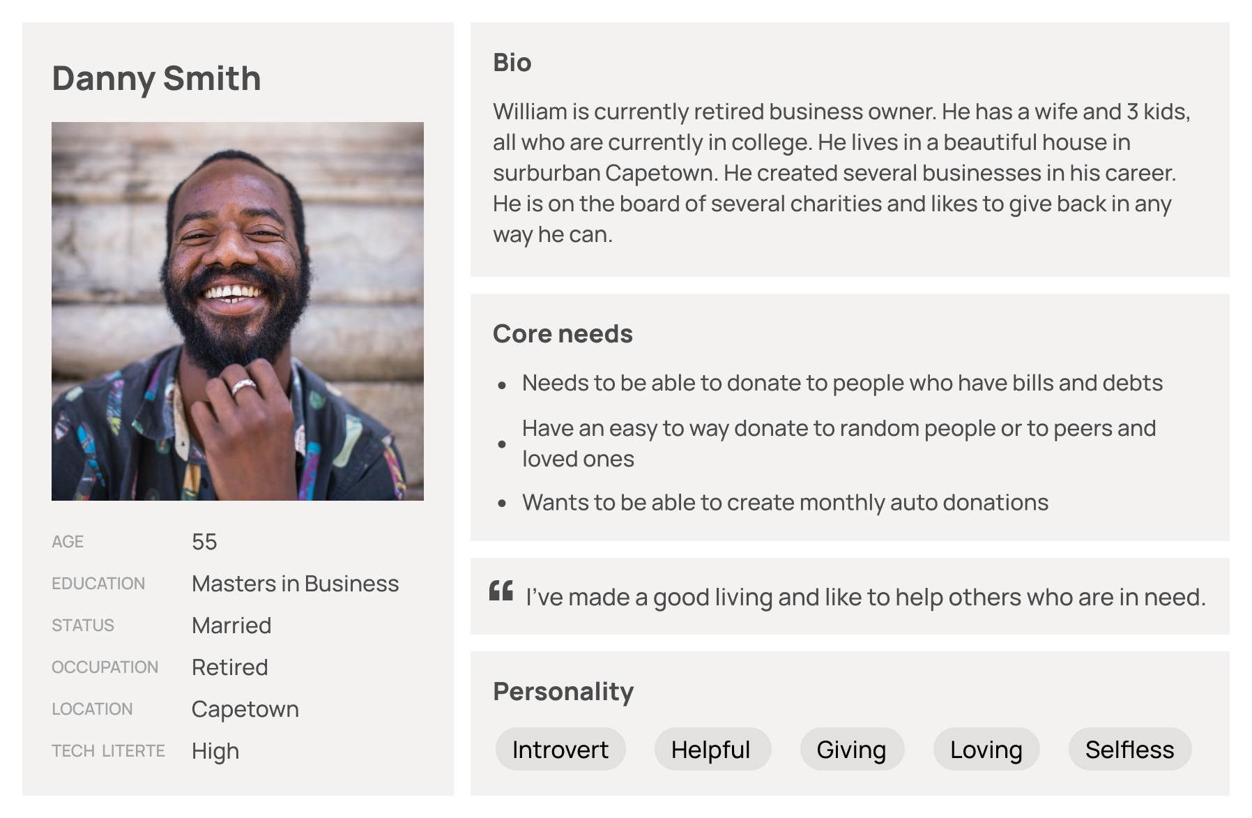
Scenarios
Danny has a sister who lives paycheck to paycheck. Although he helps out financially, he wants to also help with his niece’s college tuition. He wants to be able to set aside some money for his niece each month to help ease some stress. As he is usually very busy, he would prefer to be able to create monthly auto payments to ensure he does not miss a month.
Feature flows
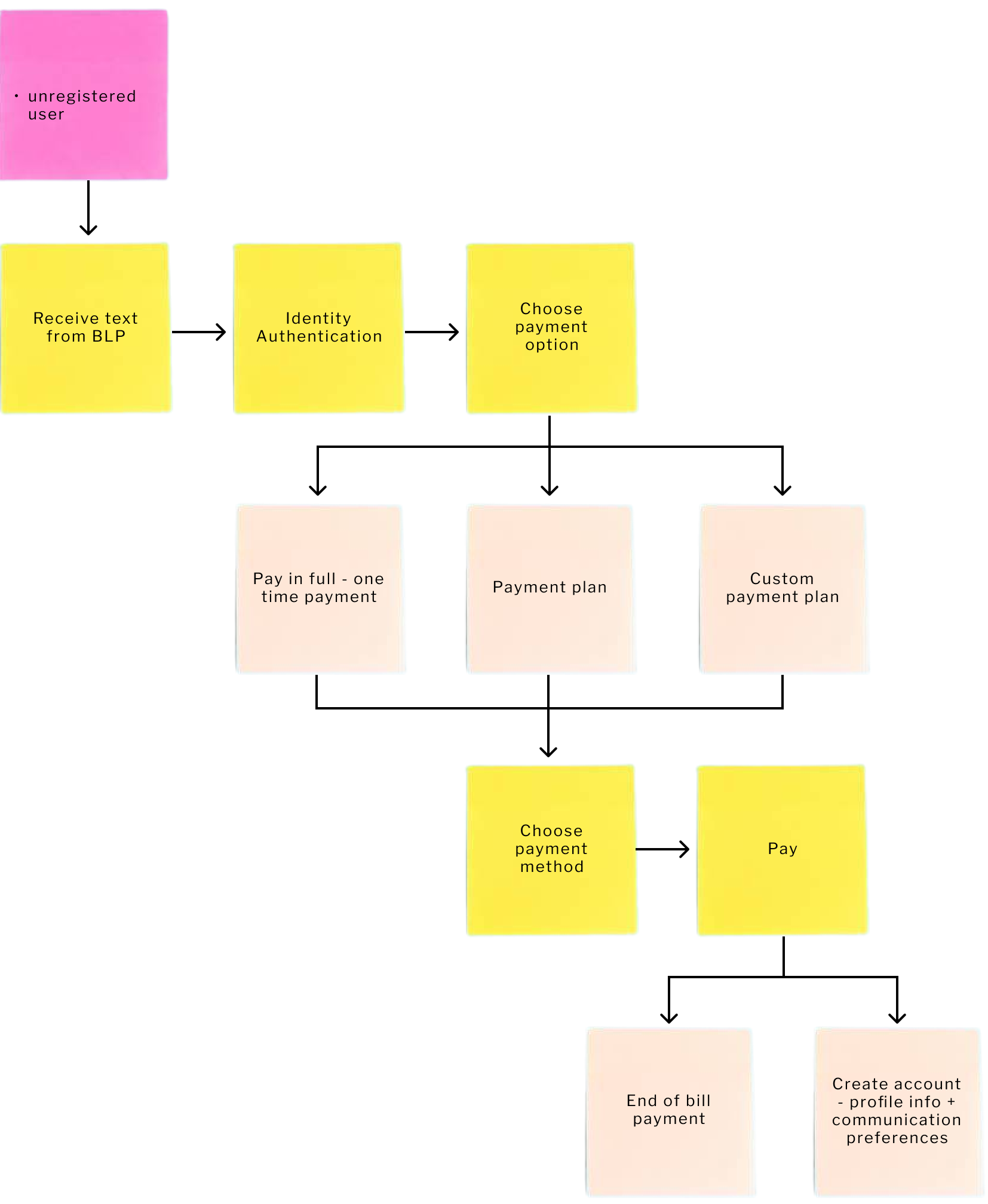
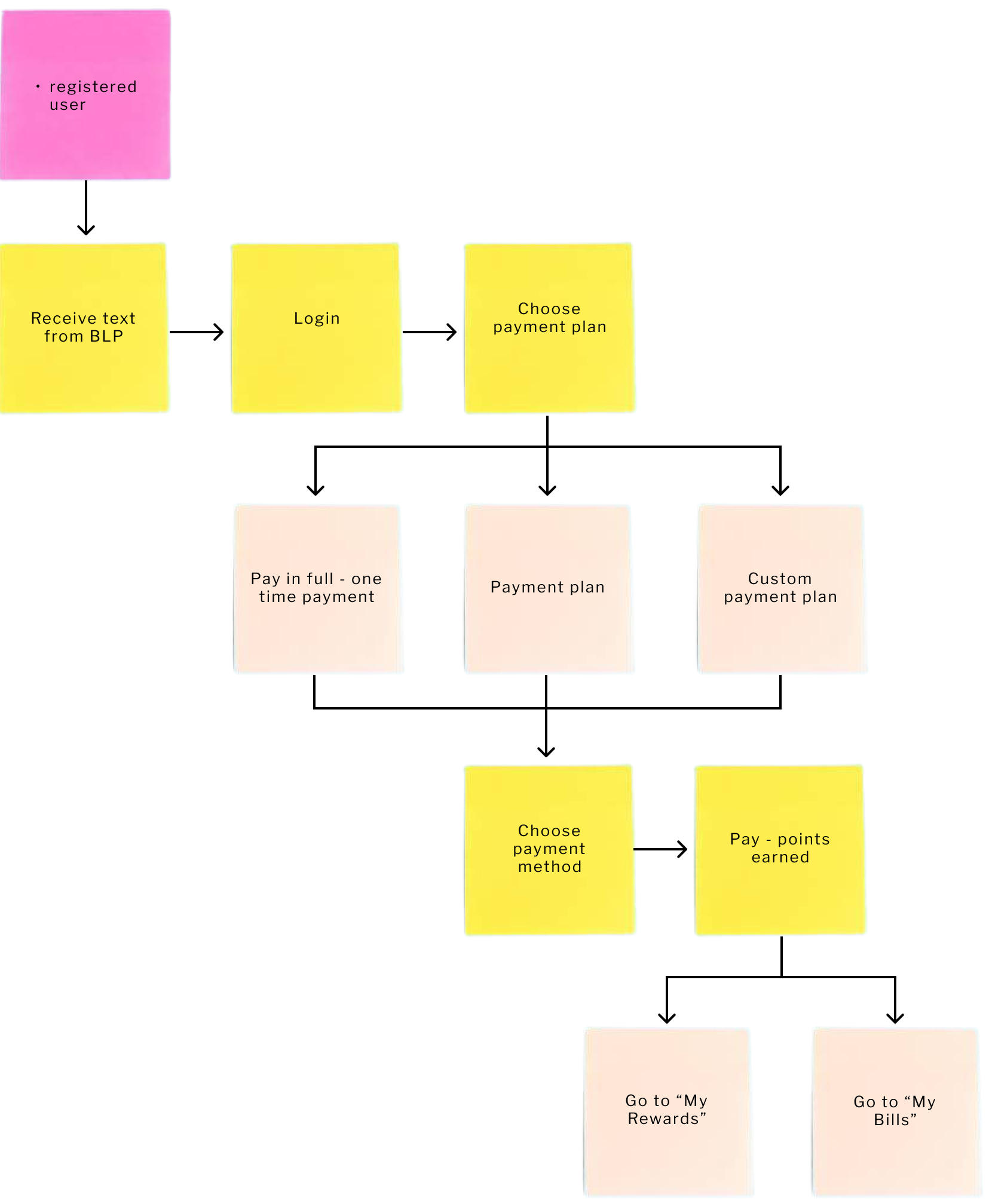
Bill pay
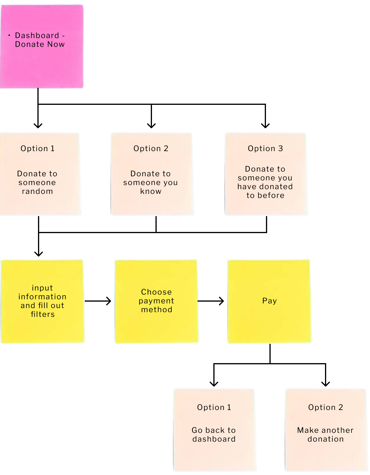
Make a donation
Once we got a clear idea of the direction we wanted to go, I started to create a few low-fidelity wireframes to give some shape to the product.
low fidelity wireframes
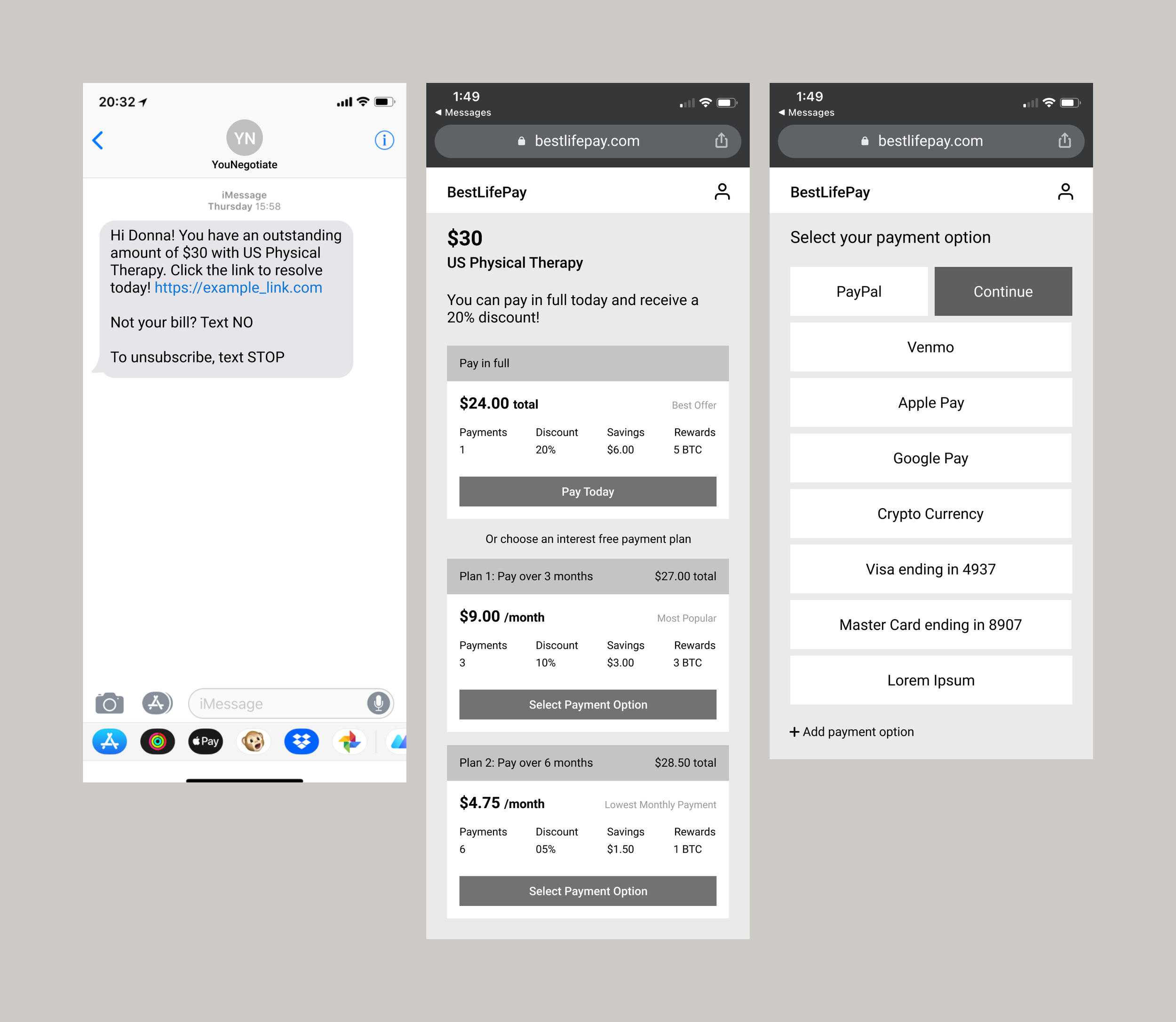
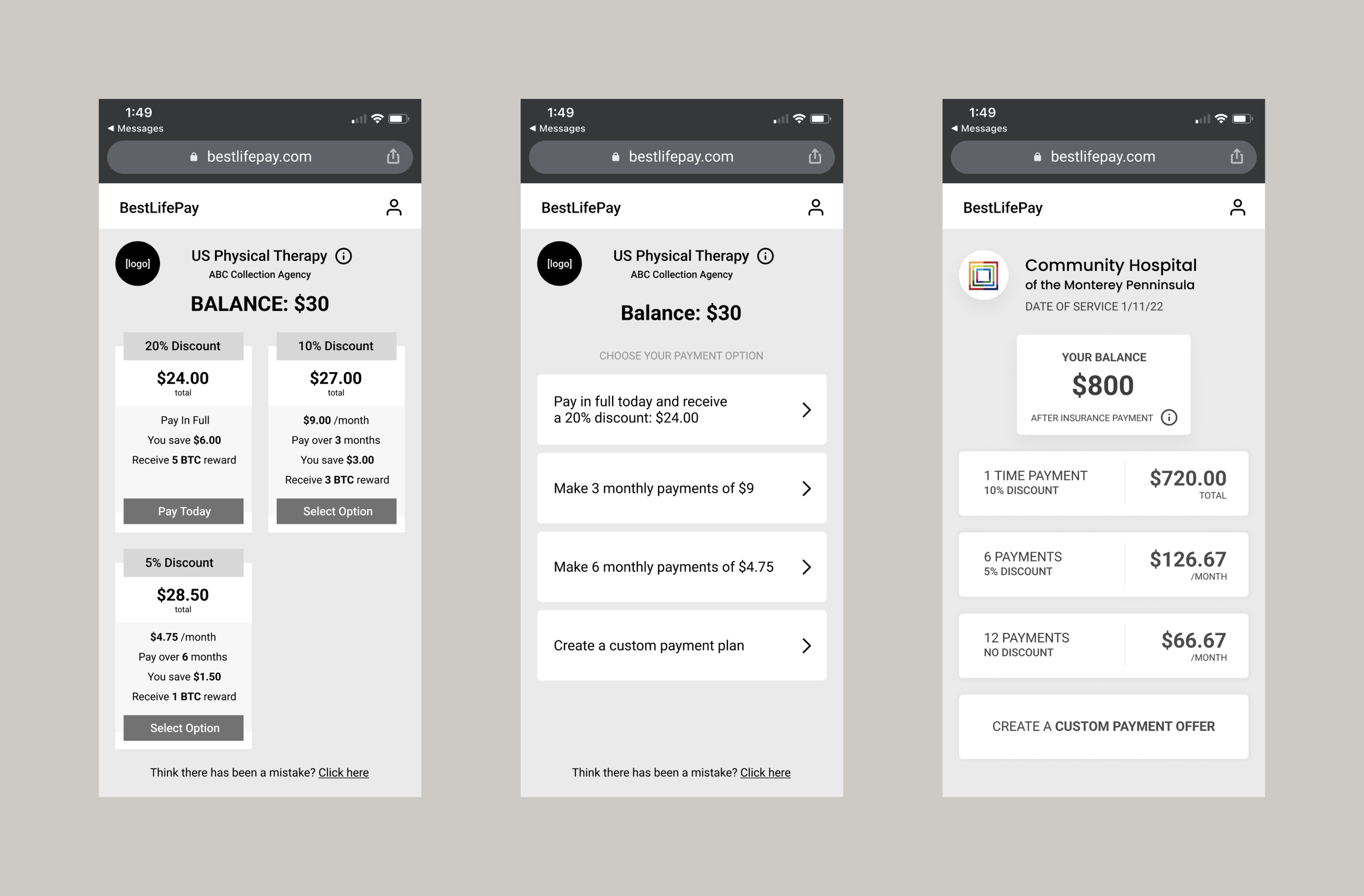
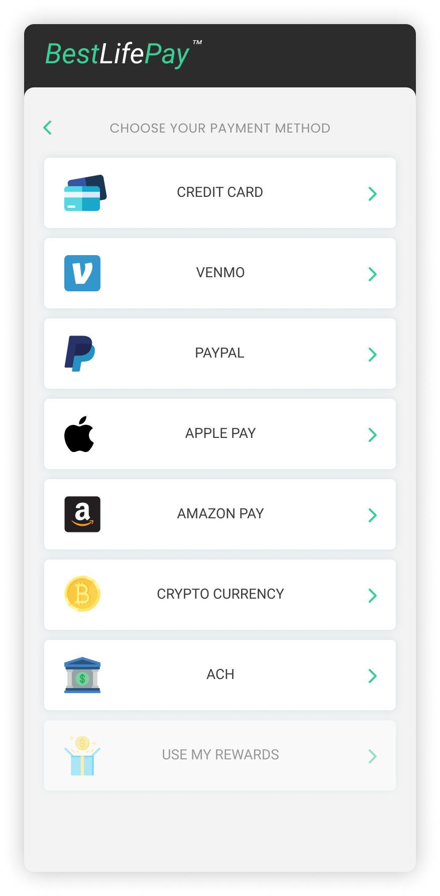
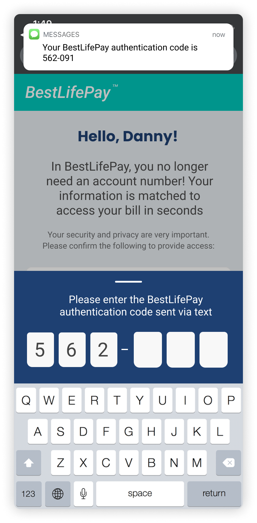
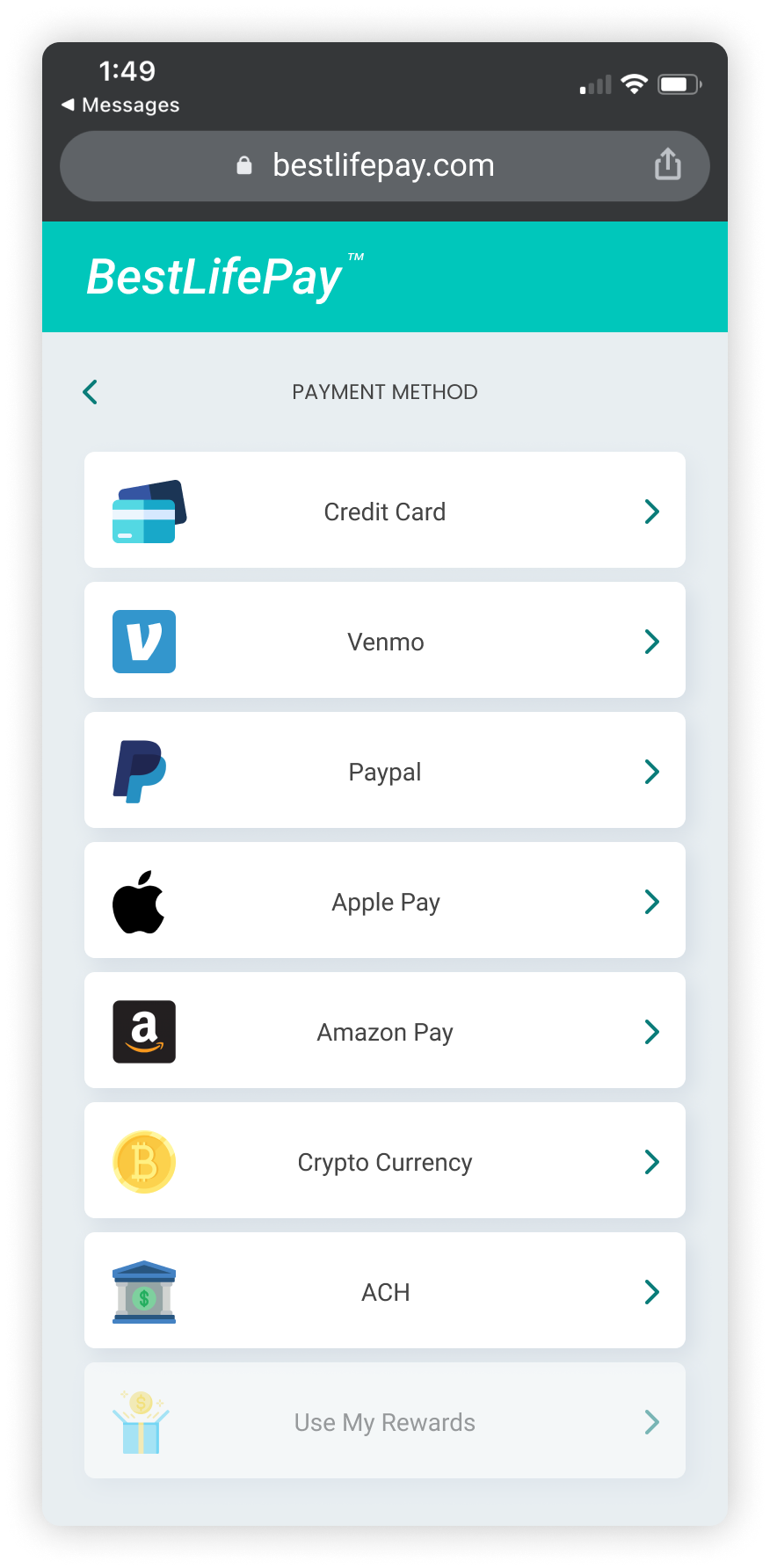
I started off with a simple flow: The user receives a text stating their bill is ready. They see the landing page with options to choose from and they can pick their preferred payment method.
It was essential to the product to ensure affordability, so we added the different payment plan options for the user to choose from.
We wanted to look into different use cases: what happens when a user already has a BLP (BestLifePay) account vs. if they don’t?
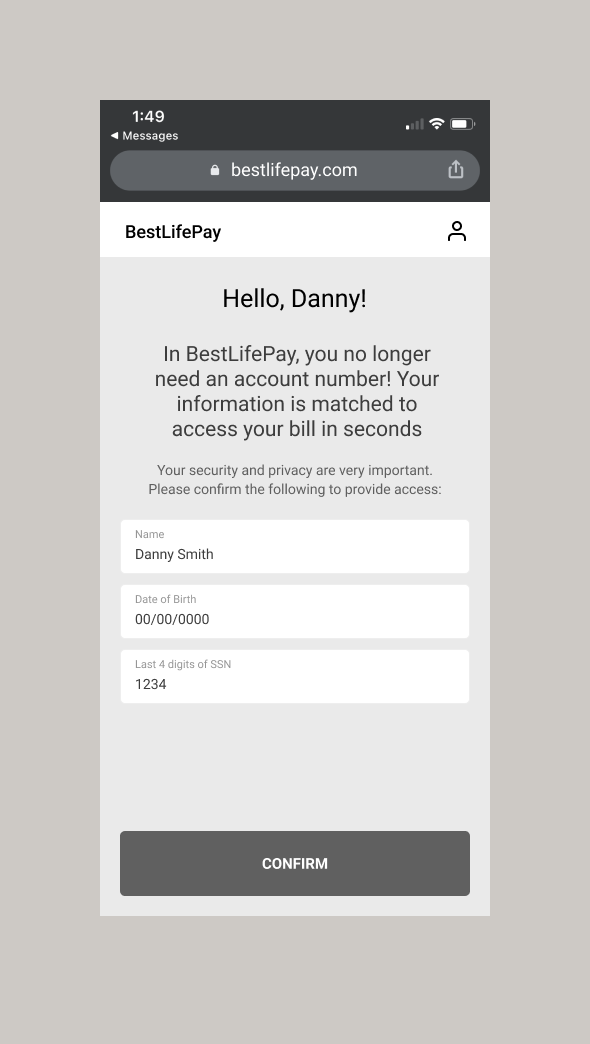
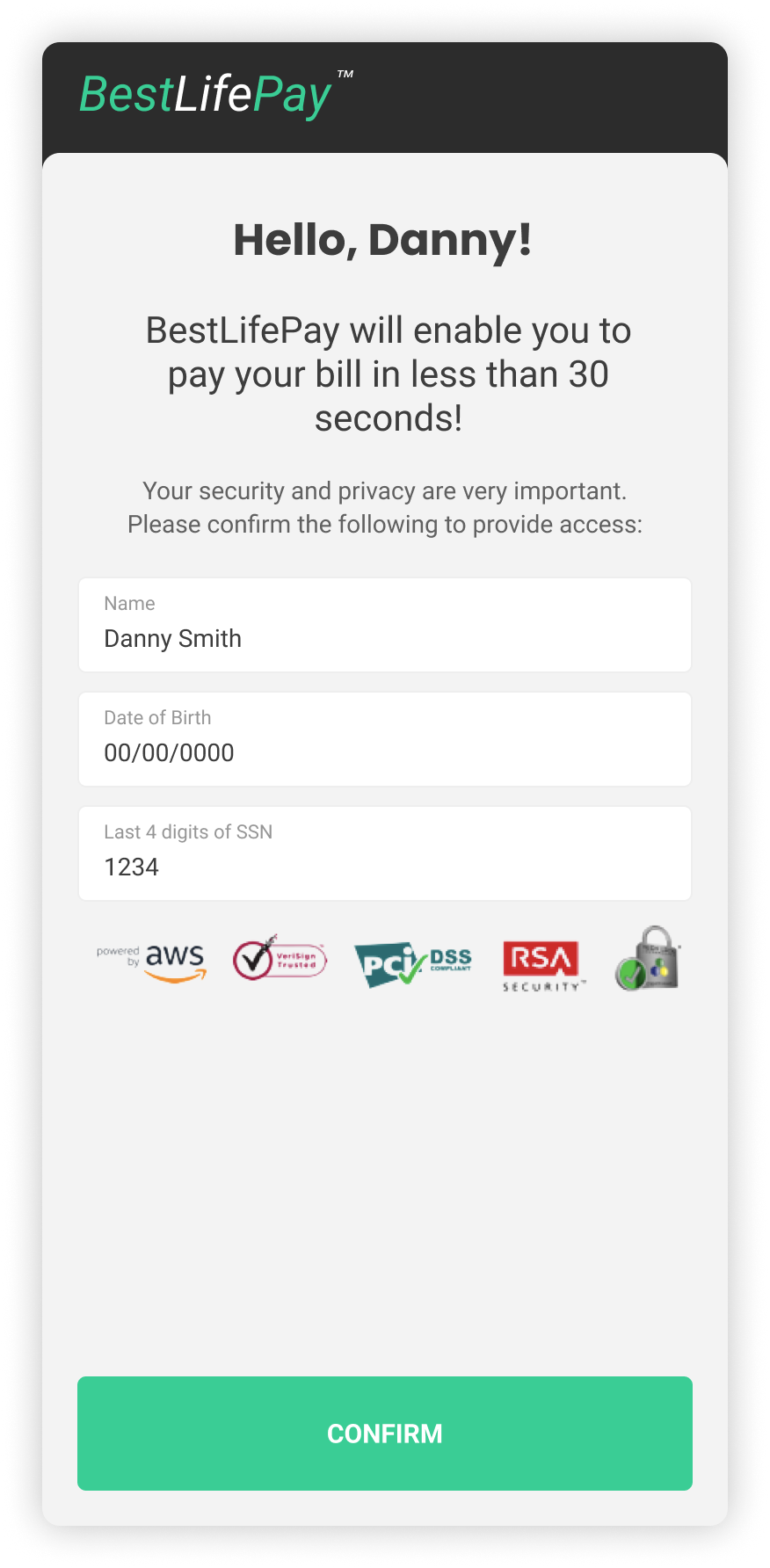
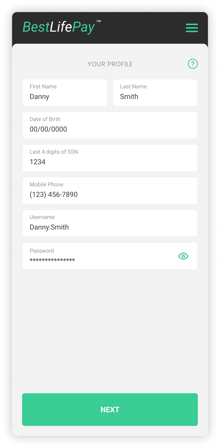
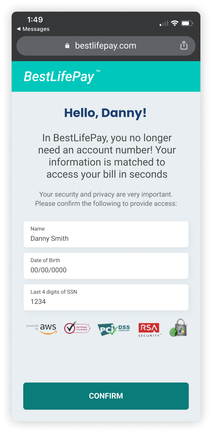
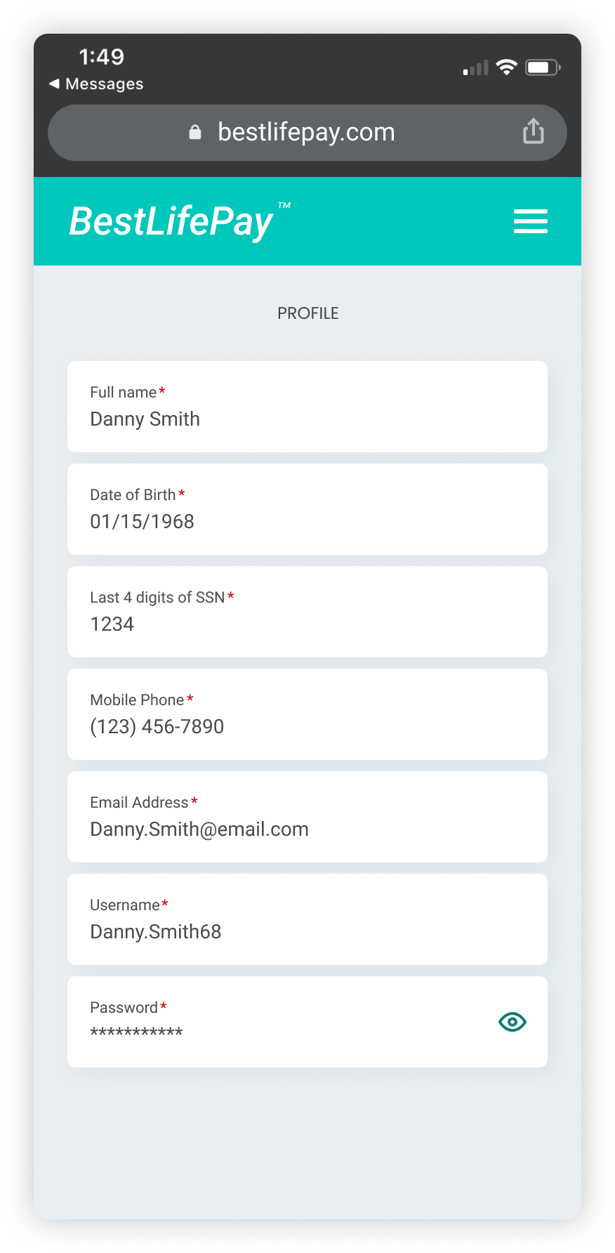
Unregistered users would be required to provide information in order for BLP to correctly match their information with the information on their bill.
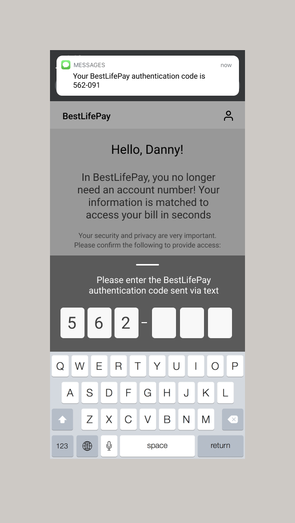
Adding an authorization screen adds trust and privacy for the user to ensure their sensitive information is safe..
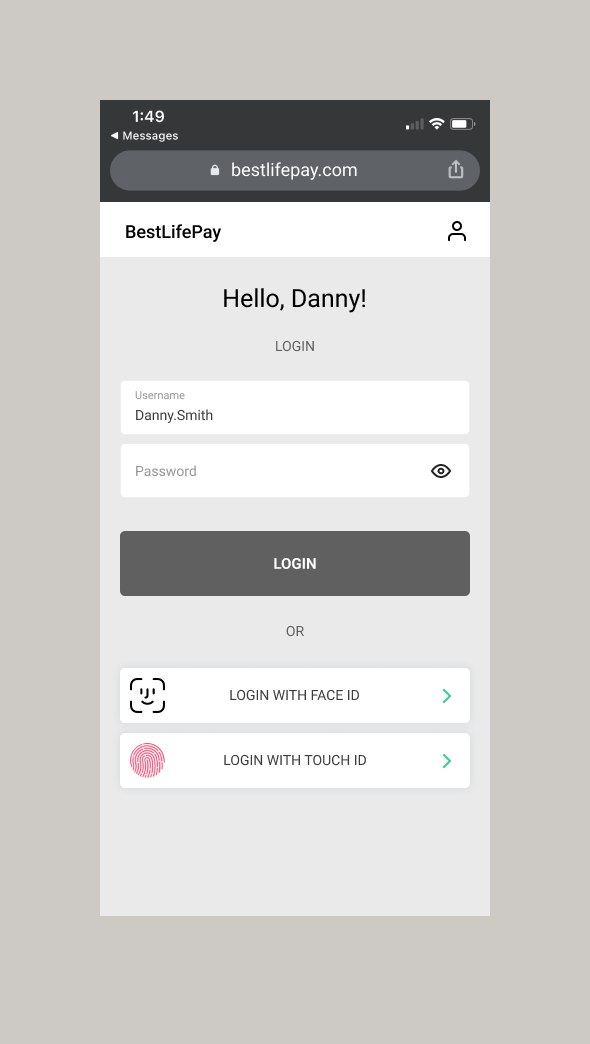
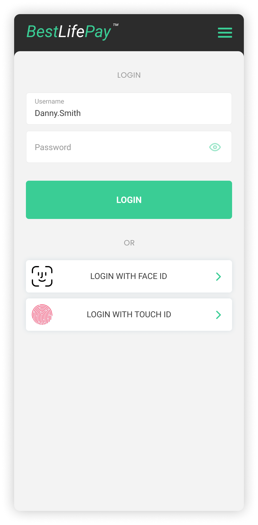
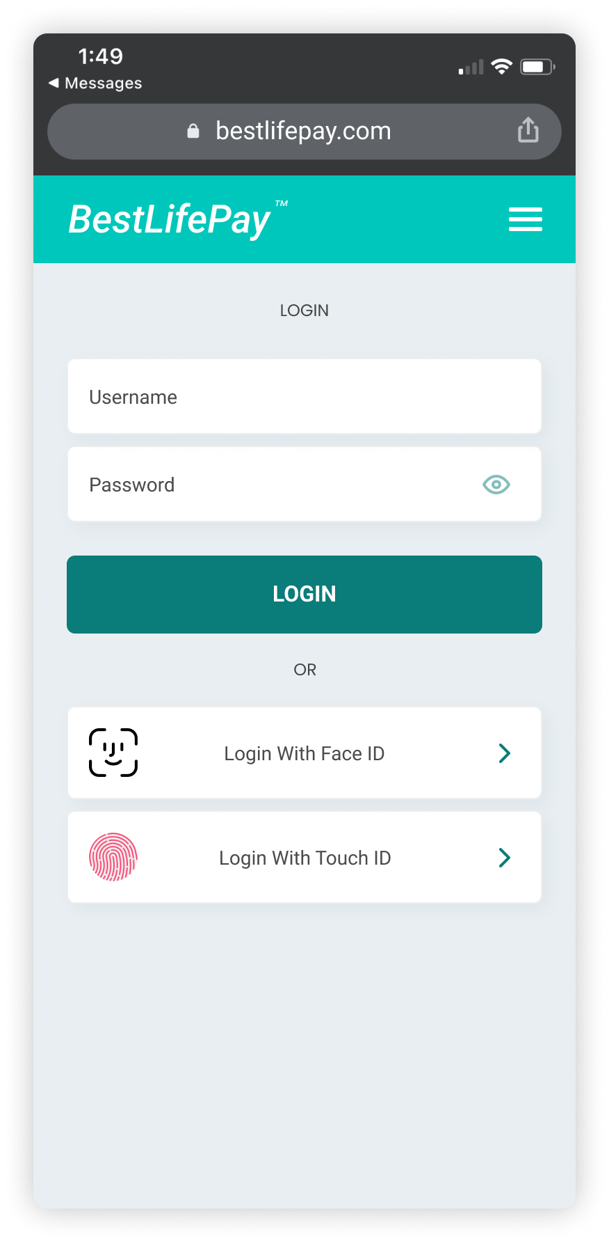
Registered users would be required to login with their username / password or touch ID / Face ID for their account information to be securely accessed.
Based on feedback from the client, I then tackled designing different variations of the landing page, as well as creating additional essential screens to get closer to the vision of the product.
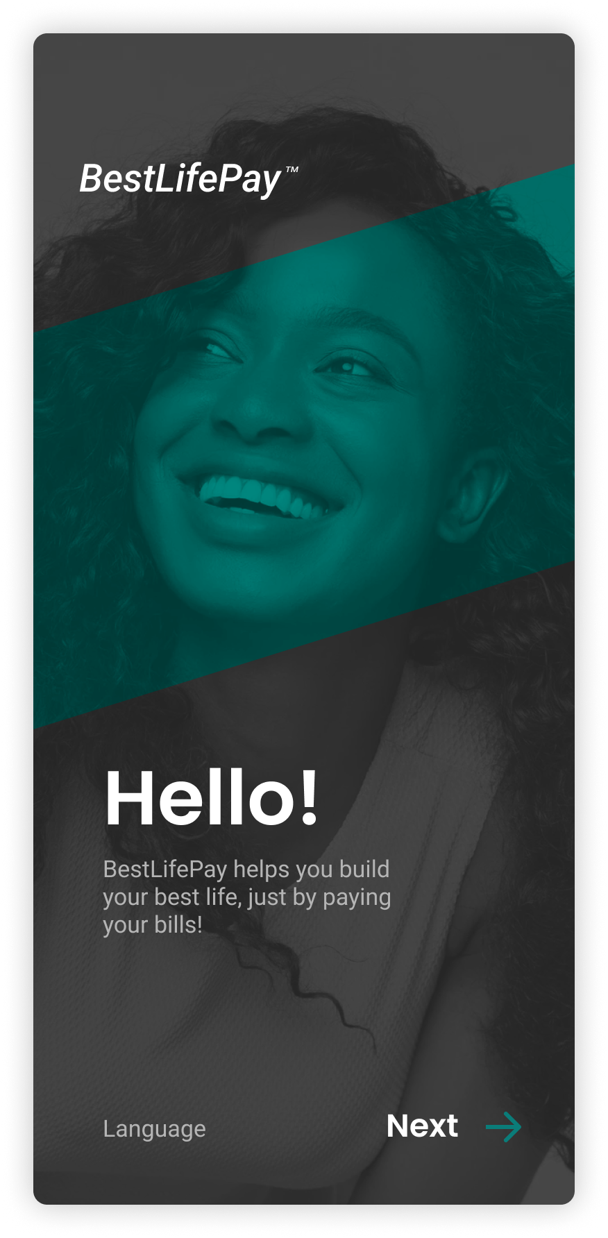
While low fidelity wireframes were being created, our Visual Designer delivered a few screens to showcase what the brand could look like. After the client’s approval, we created the rest of the wireframes with that same look and feel.
High fidelity wireframes
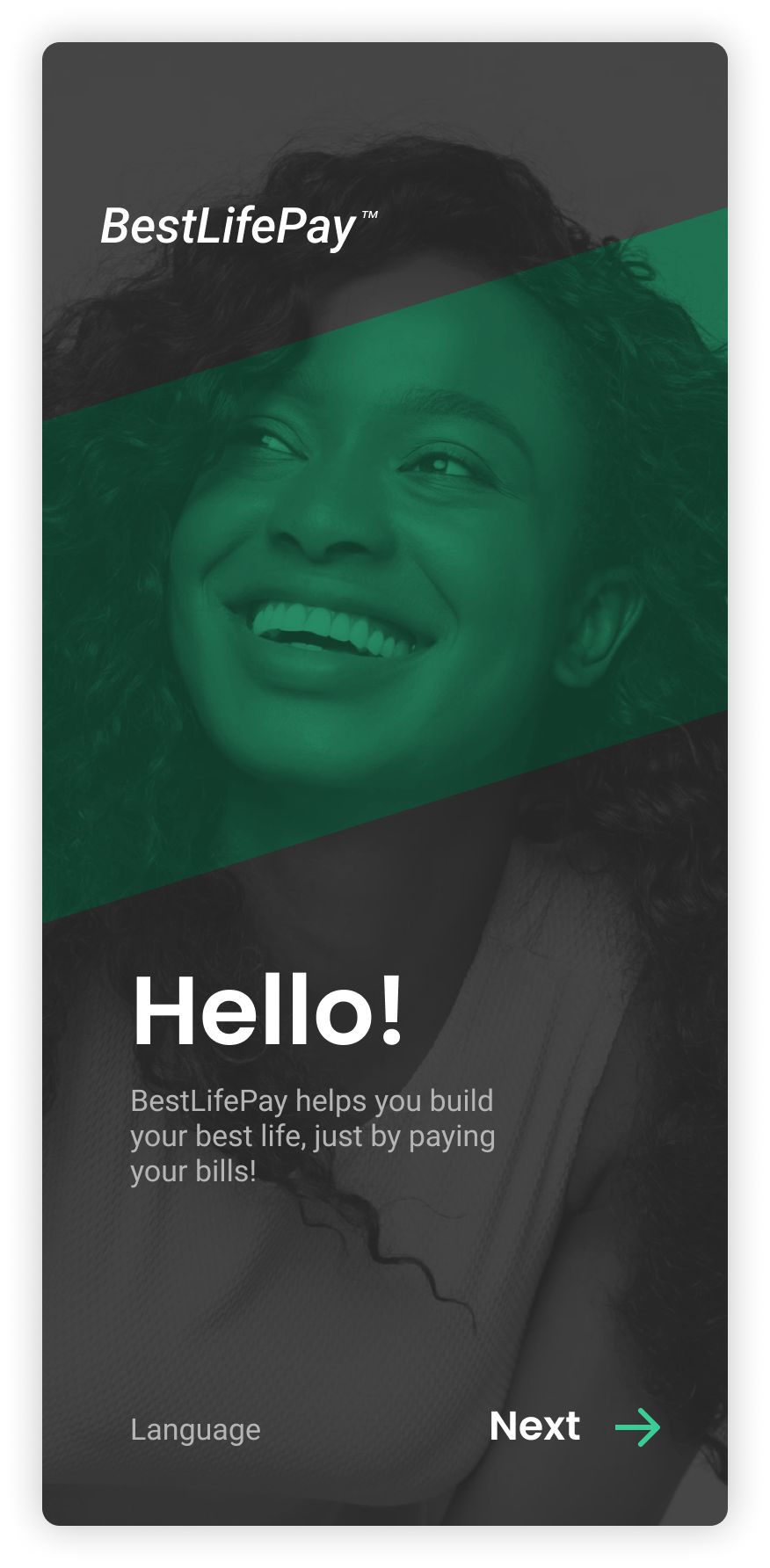
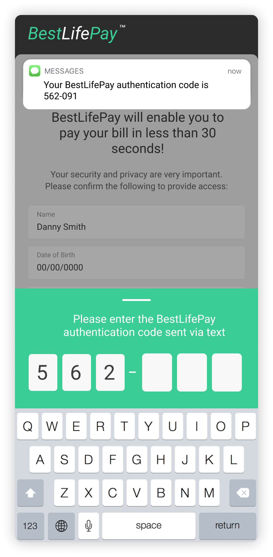
Users without an account will receive their bill via text message, allowing them to authenticate themselves to them pay their bill.
Unregistered user
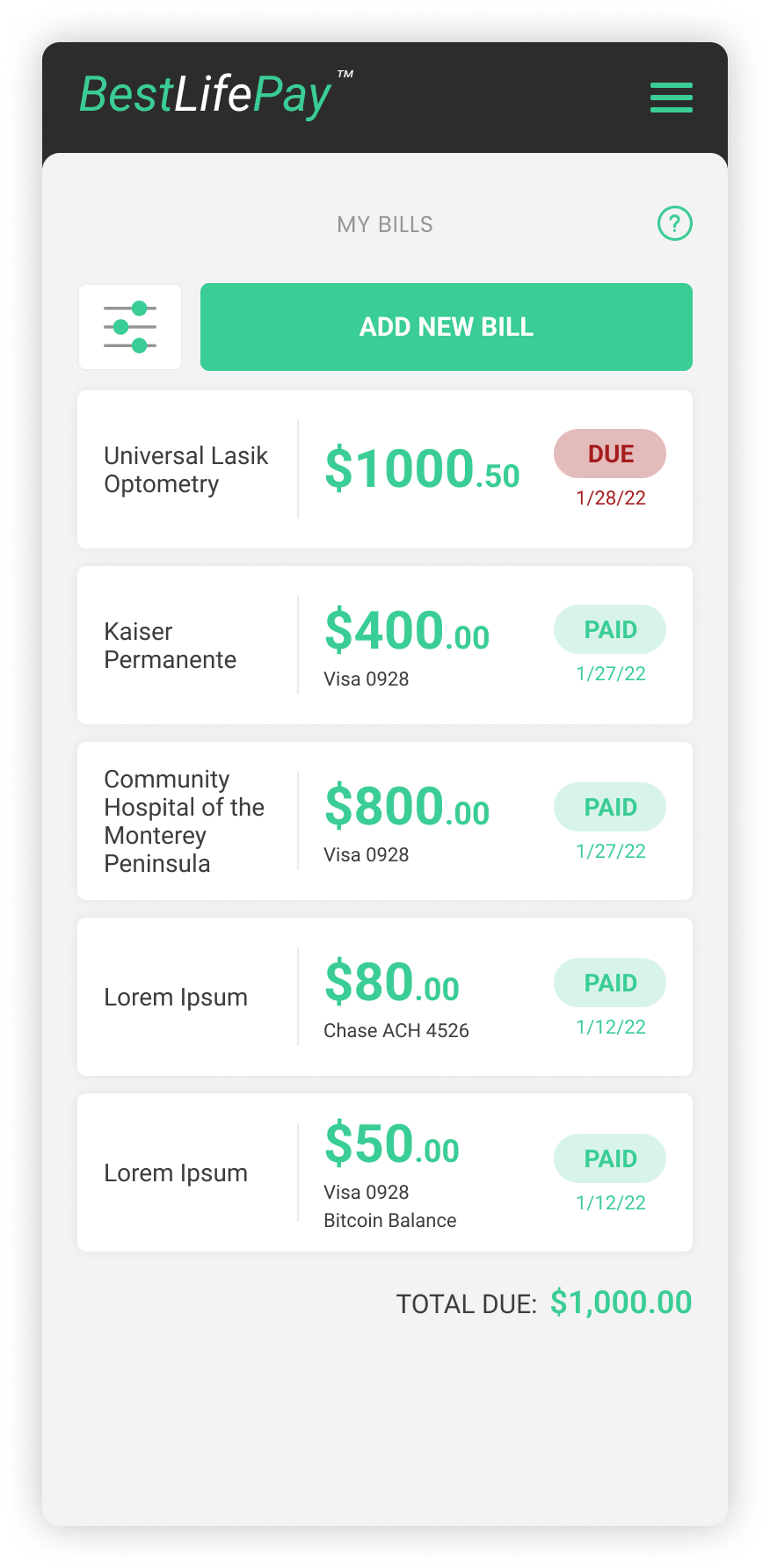
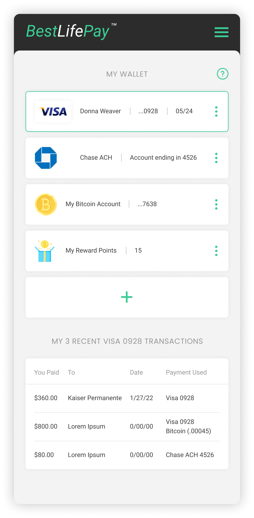
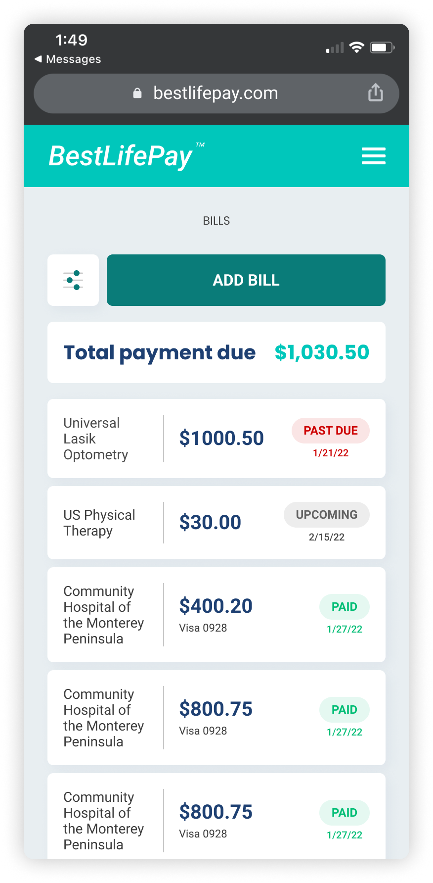
Users with accounts will additionally have the ability to view and manage their bills, rewards and wallet.
Registered user
The client wanted something more bold and eye catching so we took this opportunity to refresh the visuals and enhance the UI where needed.
visual Design refresh
While creating the mobile feature for BestLifePay, we were subsequently creating a desktop experience to allow people to send donations.
Make a donation feature
User research was to be conducted to validate the designs and get feedback from users. Unfortunately I left Catalyst before testing was done and before seeing this work completed and handed over to the client.
